You Can Afford to Design with Affordances

There is a refrigerator at the office that has both a water dispenser and an ice dispenser. The first time that anyone new to the office attempts to dispense a cool, refreshing glass of water ends with that person being splashed with water.

Care to guess why?

The design of the water dispenser is unexpected. In fact, many people first attempt to push their cup against the curved metal plate in the back (which dispenses ice, not water). After realizing that they pushed the wrong plate, many people will push the flat metal plate at the top (which does in fact dispense water). Unfortunately for them, they usually push the water dispensing plate while keeping their cup adjacent to the ice dispensing plate. As you may have noticed from the picture, the water is dispensed from the tiny spout at the top of the dispensing nook.

The end result? Splash.

Why does this happen? Why don't new users immediately grasp how to use this dispenser? Quite frankly, because the designers of this dispenser didn't make proper use of affordances.

Affordances provide users with a hint as to how something is to be used. They take the infinite number of possible actions that might activate a feature and reduce those possibilities down to the proper actions. The critical quality of an affordance is that it must be obvious.

The designers of the water/ice dispenser made a mistake by having the water dispenser's plate be flat in shape. There isn't anything about a flat, vertically-oriented metal plate that says 'push a cup here'. In contrast, the ice dispenser's curved, vertically-oriented plate practically begs you to push a cup against it.

The ice dispenser's curved plate arguably makes things more confusing for the user than having a flat plate would in this instance. The ice dispenser's affordance attracts the user to keep their cup located in the wrong spot in order to successfully dispense water. Ideally both plates would be curved, or neither plate would be curved.

Folks, take care when designing your user interfaces. Make sure that you are creating affordances in the design that make things easier for your users. They will thank you for it.

Bonus Content:

The folks at Extra Credits have a great video on the use of affordances in game design.

Fail Faster

The fine folks over at Extra Credits have an excellent video on a topic that is near and dear to my heart: failing faster. The gist of the video is that it is important to learn how to use tools such as low-fidelity prototypes to validate an idea. The key takeaway is that you want to learn from your mistakes as quickly and as cheaply as possible. Waiting until you have the perfect idea all figured out takes too much time (and really, you won't have it all figured out). Likewise, immediately jumping into writing code means that fixing your mistakes is much more expensive to do (and you will be more hesitant to do so).

I have personally been involved in this type of situation many times throughout my career. In one particular instance, I was part of a team working on a new major feature for an app. Unfortunately, the development process devolved into 'prototyping in code' as major changes were made on a daily basis to the visual design, user flow, and business logic of that feature. This was a terribly expensive way of figuring out how things should work. When we tested the feature with a few handpicked users, the flaws in our design were immediately obvious. We thought that the design was generally good and understandable (albeit with a few rough edges), but the participants in the user testing pointed out sizable problems with the design that made it clear that this feature was not ready to ship. It's as if we were blind to our own design.

After this particular experience, I championed the idea of using interactive prototypes for further design iterations. Each design iteration consisted of 'tappable screenshots' that our test users could try out and use to provide us with feedback. Making changes to a particular screen or to the user flow was as simple as dropping in a new image file from Photoshop or designating a new tappable area on an existing screen. The turnaround time for these changes could be measured in minutes or hours instead of days and weeks. In the end, the ability to 'fail faster' with the interactive prototype helped to make the feature better in a shorter period of time than what could be done with code.

Folks, I know it can be tempting to immediately jump into code; that's pretty much what developers are inclined to do. However, understand that it may not always be in your best interests to do that. Find cheaper and faster ways to validate your ideas.

Bonus:

There are many different tools that can be used to help you 'fail faster'. These are the ones that I use on a regular basis:

  • Pen and paper or a whiteboard - you really can't get much faster and cheaper than this.
  • POP (Prototyping on Paper) - this app makes it easy to take a photo of things that I have made in my sketchbook or whiteboard and add tappable hot zones with transitions.
  • InVision - this web app provides a lot more horsepower in terms of the transitions, collaboration, and version control that it supports. I use this with Photoshop mockups to provide a more "real" feel than what POP provides.

Teach Users How to Use Your App by Having Them Actually Use Your App

It's late at night. The empty cans of Red Bull tower over your desk precariously. You've done it. You've finally created your beautiful, polished, delightful app. The blood, sweat, and tears will all be worth it once you hit that delicious button to submit to the App Store.

You hesitate. You have a sense of worry gnawing at the back of your mind. 

What if users don't immediately comprehend my glorious design?

What shall I do?

I know! A tutorial! That's the ticket!

Netflix app for iOS (image via http://www.mobile-patterns.com/coach-marks)

Netflix app for iOS (image via http://www.mobile-patterns.com/coach-marks)

Suddenly, your beautiful app isn't so beautiful anymore. You've decided to smack the user in the face with a brain dump tutorial.

...

Why is it that so many apps fall for this trap? The most common reasons seem to be that app developers run out of time to properly implement a tutorial system or the developers fail to realize that the onboarding experience is an integral part of the app that requires just as much design effort (perhaps even more effort) as the rest of the app. Yet, it is still common to see apps that don't give much thought to how users will learn to use the app.

Whatever feelings you may have about Facebook's Paper app, they at least took a relatively uncommon approach to the problem of teaching users how to use an app with an uncommon design. While it may be somewhat heavy-handed at times, the tutorial system in Paper clearly took a bit of time to design and implement. In fact, the Facebook Paper team gave a presentation on how they approached the problem with contextually aware tutorials.

Developers can look outside of the traditional app development industry for inspiration as well. The game industry has spent decades working on this very problem. Take, for example, this analysis of the first level of Super Mario Bros. by the folks at Extra Credits:

The game designers at Nintendo carefully crafted the first level experience to teach players the skills that they will need throughout the game. They did so without dumping a bunch of explanatory text right at the start of the game or requiring that a player read the manual.

You might very well ask, 'how can these same design principles be used when creating an app?'

For starters, you should consider what your first-run experience is like for a user. Does your app have a bunch of empty states? Design a way for those empty states to have a call to action or design the app's first-run experience so that the user doesn't have those empty states to begin with (for example, pre-populating an app with content that the user is reasonably expected to enjoy). Does your app involve a complicated ecommerce transactional experience? Design a way for users to get progressive disclosure on where they are in the process.

Folks, Super Mario Bros. doesn't bombard players with every possible bit of information they could ever need at the beginning of the game, and there is little reason why apps should be any different. Teach your users how to use your app by having them actually use your app.

Bonus:

If you enjoyed the design analysis done by Extra Credits, you might also enjoy these videos (warning, they are longer videos and may include profanity so be careful at work).


The Complex World of the Simple, Tiny, Insignificant Progress Bar

One of my earliest professional programming tasks was to create a progress bar for an application. The requirements were simple, really: show the user how far along the application was in its processing of a new data set. Easy, right?

Wrong. As it turns out, for many tasks it is actually non-trivial to display a meaningful progress bar to the user. Predicting the future can be difficult, it seems.

In fact, there is some serious HCI (human-computer interaction) research being carried out regarding the progress bar and its impact on user experience. One such paper focused on displaying the progress information in a variety of ways--while keeping the task time constant--and showed that people can consider a progress bar to be faster or slower even though the time it took to complete was exactly the same. A follow-up paper further explored the progress bar by changing visual attributes (for example, making the bar pulsate at different frequencies). Once again, the time to complete was always the same but the human perception of the passage of time was varied.

Just for fun, check out some of these progress bars: http://www.animatry.com/blog/progress-bars

Do any of them seem familiar? There is an excellent chance that you've encountered them while copying a file in Windows or installing the latest version of OS X. I bet you've even programmed one of these.

As for my younger self, I spent quite a bit of time implementing and refining the progress bar for that data installation process. The exact design of the final solution has been lost to my memory in the mists of time, but as I recall it was some combination of an overall percentage with a 'live' update of the current files being processed. The overall percentage gave the user a rough sense of how far along the application was in the process, and the file names (which flew by far too quickly to be meaningfully absorbed by the human consciousness) gave the user the reassurance that the process was indeed continuing and hadn't gotten stuck somewhere. Perhaps not the optimal solution, but it got the job done.

Folks, don't let anyone tell you that adding a progess bar is an 'easy' task.

You Don't Have to Trick Users Into Buying In-App Purchases

I received some excellent feedback for my post on freemium's negative impact on video game design. Part of that post was about in-app purchases, and some folks had the impression that I was against in-app purchases as they relate to game design. That is not the case. I don't think that in-app purchases are bad per se, but I do recognize that they have been misused in recent years (especially in freemium games).

If freemium games are littered with examples of 'bad' in-app purchases, then what kinds of in-app purchases could be considered 'good'? 'Good' in-app purchases are the kind that add to the player's enjoyment without being detrimental to the player or to gameplay. To put it another way, game designers should always strive to make in-app purchases fun and fair .

Here are some examples of good in-app purchases. Please note that I am sometimes referring to a particular in-app purchase in isolation from other 'bad' in-app purchases. 

Character Customization

The iOS game Punch Quest has a good example of in-app purchases related to customizing the player's character. By default, a player has a limited set of options to choose from (male/female and a few colors). If a player wants to use a different garment color, add a hat, or choose a different face then they can buy an in-app purchase for their character. Their character is not impacted by these selections in any meaningful way, thus maintaining balanced gameplay. People often want to customize their in-game avatar, and this is a good way for devs to fulfill that desire in a profitable way without resorting to tricks.

Options. 

Options. 

New Songs/Levels

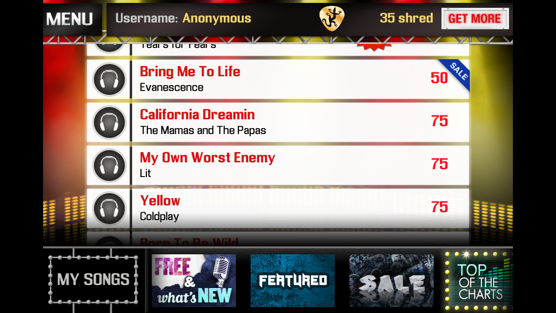
Having in-app purchases that allow players to buy new songs or additional levels to play can be a good way to provide ongoing customer satisfaction. Magic Guitar comes with several songs preloaded, and users can purchase additional songs that they wish to play. These types of in-app purchases help keep players engaged in the game without going into addiction territory.

California Dreamin, baby.

California Dreamin, baby.

Unlocking Levels/Chapters

Another way to make use of in-app purchases is to let users unlock all of the levels/chapters in the game. Rock Runners, for example, normally requires users to complete levels in order to unlock new levels. There is an element of chance and choice to how its game map works when users unlock levels. An in-app purchase that lets the user unlock all levels is a good way to balance the needs of skillful players (who can earn their way to all the levels) and the needs of less skillful players (or players that don't have quite enough time to master the game). The latter can still gain access to all that the game has to offer, but without any significant sacrifice in game balance or fairness.

Not a bad price.

Not a bad price.

Folks, in-app purchases for games aren't all bad. In fact, some of them can be quite good for devs and players alike. Just remember to keep things fun and fair. 

Freemium is Hurting Modern Video Game Design

If anything has hurt modern video game design over the past several years, it has been the rise of 'freemium'. It seems that it is rare to see a top app or game in the app stores that has a business model that is something other than the 'free-to-play with in-app purchases' model. It has been used as an excuse to make lazy, poorly designed games that are predicated on taking advantage of psychological triggers in its players, and will have negative long term consequences for the video game industry if kept unchecked.

Many freemium games are designed around the idea of conditioning players to become addicted to playing the game. Many game designers want their games to be heavily played, but in this case the freemium games are designed to trigger a 'reward' state in the player's brain in order to keep the player playing (and ultimately entice the user to make in-app purchases to continue playing). This type of conditioning is often referred to as a 'Skinner box', named after the psychologist that created laboratory boxes used to perform behavioral experiments on animals. The folks that create the Penny Arcade - Extra Credits series of videos have a good video describing the use of the Skinner box in video games that is recommended viewing on this topic. The use of this type of design is at best ethically questionable and at worst deplorable. It is one thing to create a game that is so fun that players don't want to stop playing, and another thing altogether to create a game that preys on its players using behavioral tricks.

Freemium games are often examples of some of the laziest and most poorly designed games. They usually include some sort of 'energy meter' that is designed to limit how much time the player can play the game before they either have to wait long periods of time until the meter recharges, or pay to continue playing immediately. This often results in nonsensical gameplay elements such as the player's character getting 'fatigued'  without any in-game recourse other than plunking down cash to instantly recuperate. Similar to this design is in 'endless runner' games where the player can 'revive' their character after colliding with an obstacle (which would ordinarily end the run). Another troublesome freemium design is to encourage users to 'pay to win'. The player can simply purchase the most powerful weapon/item/whatever in the game rather than earning it via playing the game. This has implications on game balance in competitive games, and raises questions about whether players are actually playing a game if they can just convert money into victories. In all of these cases, the game is designed to keep the player from playing the game unless they open their wallets.

Freemium is currently having noticeable negative effects on the video game industry and will have negative effects on the industry in the future. Perhaps the biggest impact is that freemium skews the market's perspective on pricing. Users are becoming accustomed to app and game prices that are unsustainably low. It's depressing to see complaints about games being 'too expensive' when they are priced at five dollars or less. (Michael Jurewitz, by the way, has an excellent series of blog posts on app pricing and why low prices aren't the only way or even the best way to achieve profits.) Zynga's rise to prominence was partially based on its use of freemium design, and its fall can be blamed in part on an over-reliance on freemium. It simply isn't sustainable to have such low prices, and the result is that legitimate game dev shops go out of business while the sleazy game dev shops create games that aren't really games but instead elaborate psychological traps.

Folks, games should not be designed by spreadsheets. You can do your part to support good game design by paying for games that are truly fun. Don't get trapped in the Skinner box. 

'Designing for a Touch Screen'

The Penny Arcade - Extra Credits series of videos on game design and game culture topics are generally quite excellent. This particular video covers some of the challenges and follies when designing games for a touch screen.

Perhaps the most interesting statement in the video is the idea that having a 'virtual joystick' on a touch device is an example of poor design. I have to say that, in general, I agree. I most often see this type of design in games that try to emulate the traditional platformer style (e.g. 'Mario' style games). This type of game doesn't really lend itself to a touch device since the virtual joystick is much more error-prone than what would be acceptable in a platformer. Typically, the best way to handle a platformer type of game is to create an 'endless runner' type of game where the controls are simplified to a single touch (such as in Rock Runners) or at most two different touch spots (such as in Punch Quest). Perhaps the only good example of a virtual joystick is in Zombiegal Kawaii, and I think that really only works because it is a shooting game (instead of a platformer) where the lack of precise controls isn't quite as apparent.

Folks, watch the video in the source link.